Reviews

Lofree Edge as a 75-percent keyboard, the Lofree Flow 2 as a compact 68-percent keyboard and the matching calculator as a small mechanical companion in the test

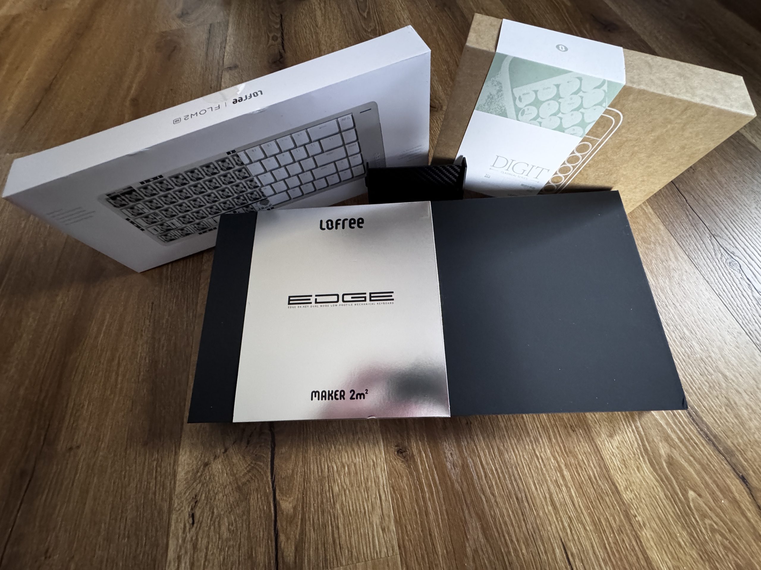
Introduction and unboxing

The two keyboards Lofree Edge and Lofree Flow 2 belong to the class of compact 68 percent boards, while the small calculator complements the series as a handy companion. The connection between the devices is created by a similar design language, a consistent user experience and the idea of elevating functional everyday tools to an aesthetically pleasing level. The keyboard models are based on different technical approaches, but pursue the same goal, namely efficient working in as little space as possible. The calculator, on the other hand, is a compact tool for quick access to basic calculation tasks and its design blends seamlessly into the overall picture.

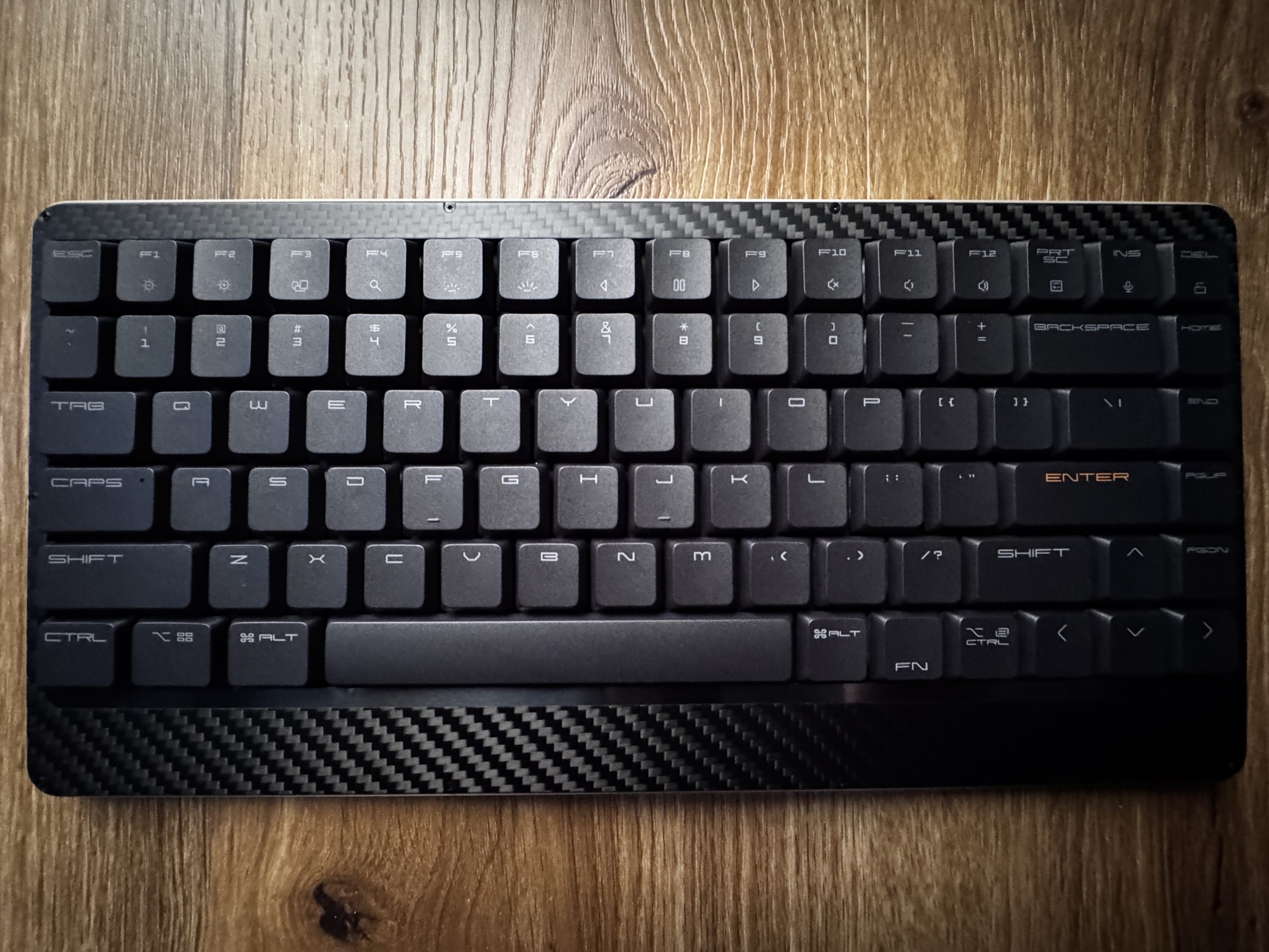
The Lofree Edge presents itself as a particularly slim model, which is particularly striking due to its reduced height and lightweight aluminum structure. This gives the board a modern and unobtrusive appearance and is aimed at users who place a clear focus on mobility and a discreet look. The key arrangement in 68 percent format creates a compromise between comfort and space saving, making both everyday typing and more extensive usage scenarios comfortable. Particularly worth mentioning is the precise workmanship, which gives the board a noticeable stability. The internal dampening creates a quiet, controlled sound that pleasantly rounds off the typing experience and ensures a harmonious profile.

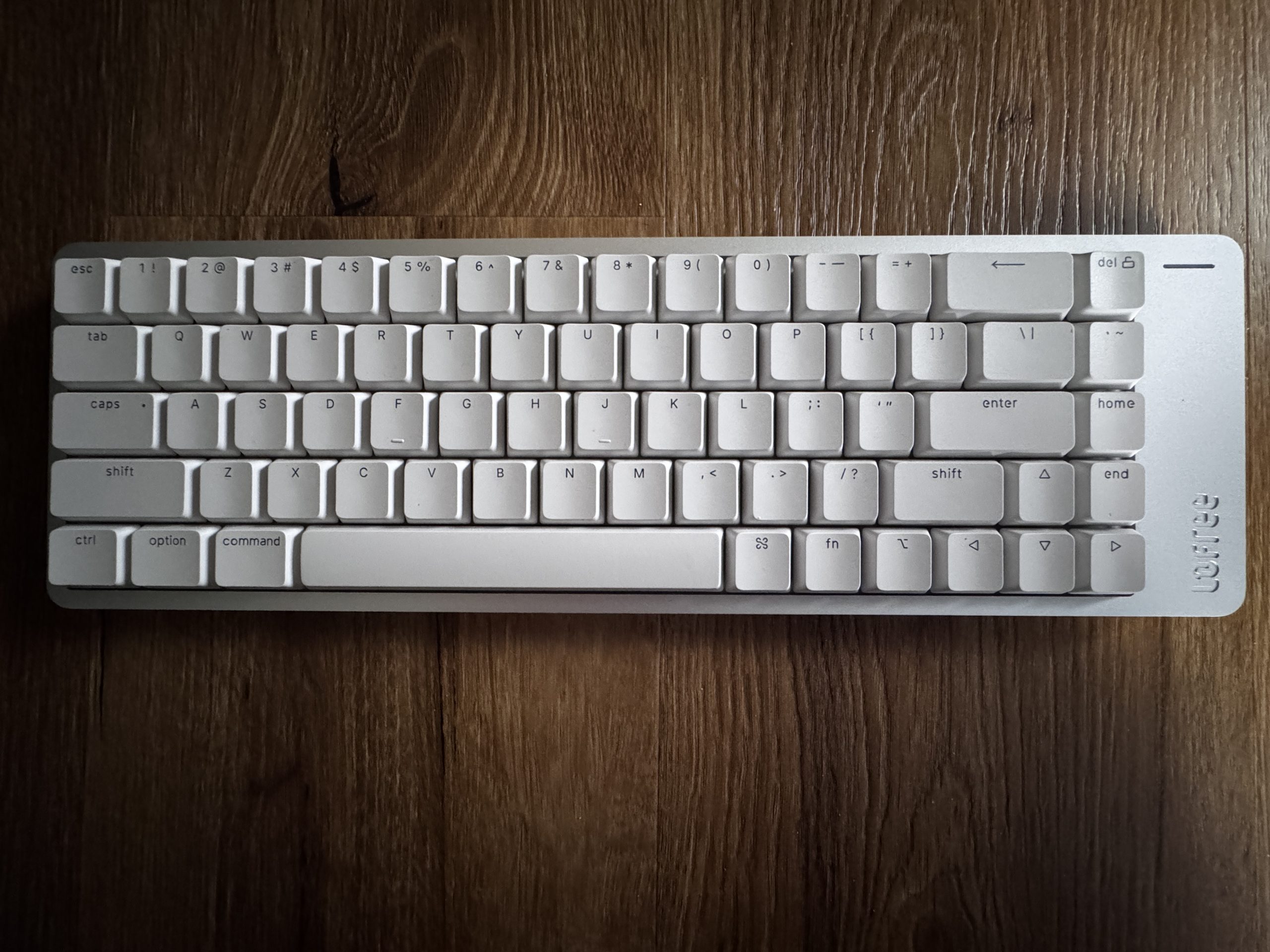
The Lofree Flow 2 follows the same basic idea, but places more emphasis on a slightly fuller writing feel and a more pronounced acoustic presence. The slightly different housing design creates a soft yet defined sound character that is noticeably different from the Edge and creates its own identity. The layout retains the 68 percent format, making it easier for users to quickly transition between the two models. The mechanical switches respond cleanly and evenly, which ensures precise inputs and makes longer work sessions more pleasant. At the same time, the surface texture has a very high-quality appearance, which makes a lasting impression both visually and haptically. The result is an overall picture that is suitable for both intensive writing activities and creative tasks.

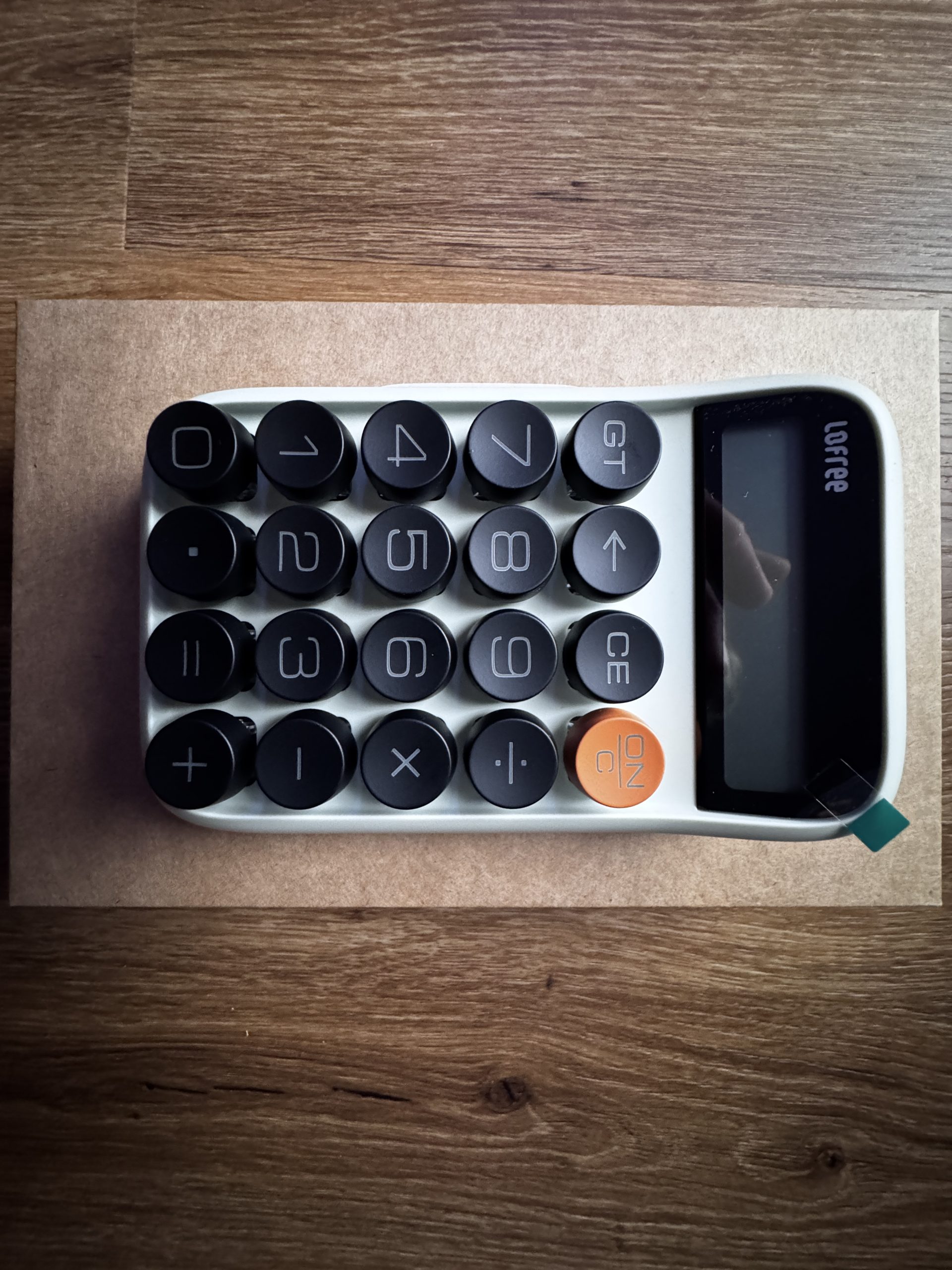
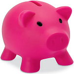
The compact calculator has a significantly different shape, but follows the same design line. Its reduced size makes it particularly suitable for mobile use and short calculations. The keys respond reliably and provide clearly defined feedback, allowing entries to be made quickly and without delay. The functionality remains deliberately focused so that basic arithmetic operations are immediately available. The compact design makes it easy to place on a desk, in a bag or in a rucksack and creates a pleasant extension to the two larger devices. The harmonious choice of colors and materials ensures that the calculator is visually perceived as the little brother of the two keyboards and completes the entire set in a harmonious way.

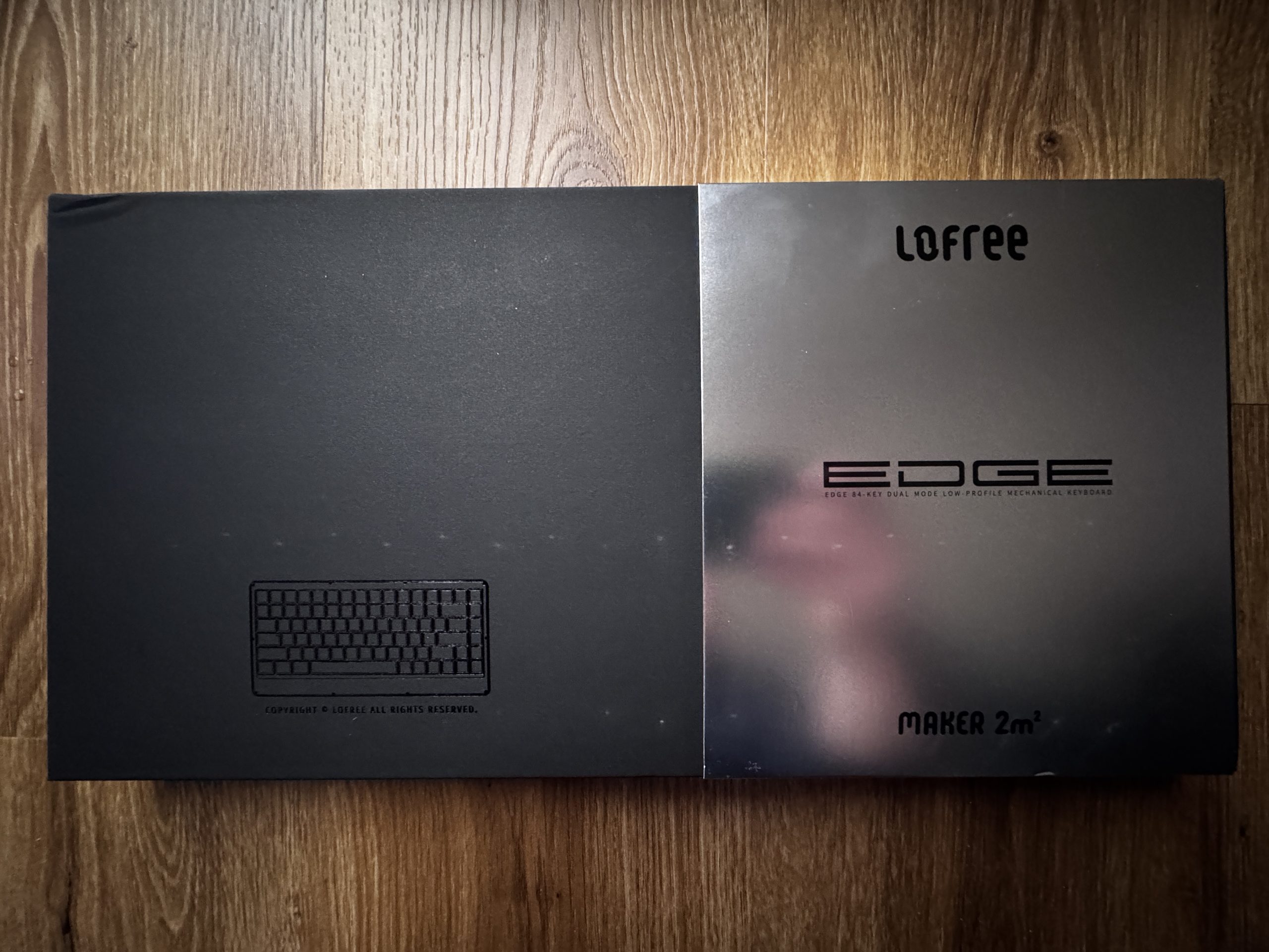
The packaging of the Lofree Edge keyboard. A completely black box with an embossed representation of a keyboard. On the outside is a shiny metallic cardboard box with the Lofree lettering and the name Edge. Both parts of the packaging lie next to each other on a wooden base and give a high-quality, clearly structured first impression.

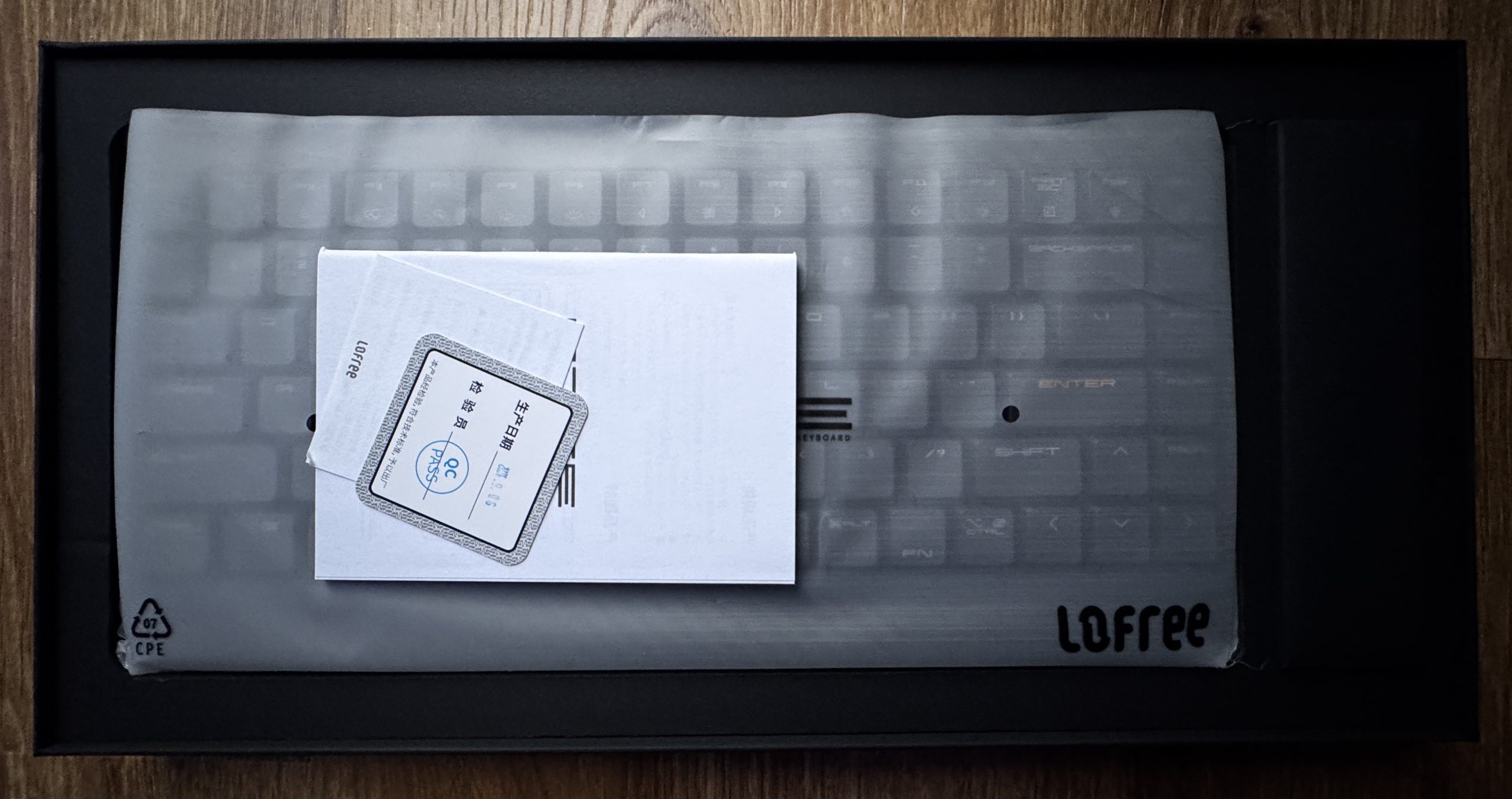
The keyboard is well protected in a milky plastic cover so that the keys only show through slightly. There are several small documents on the top, including a warranty card and a quality control slip. The packaging is black and looks sturdy and cleanly structured. The contents are neatly arranged and give the impression of a high-quality product that has been carefully packaged.

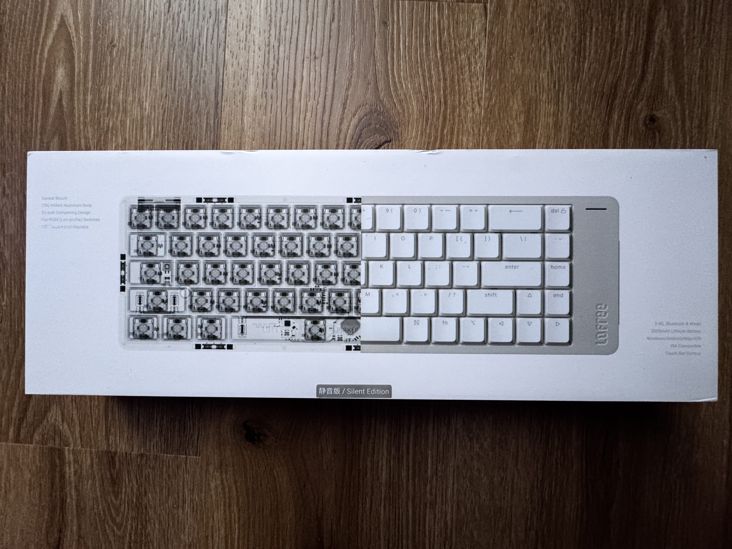
The packaging of the Lofree Flow 2: The box is predominantly white and has a transparent representation of the inner keyboard structure on the left-hand side. The complete keyboard layout can be seen in white to the right. The lettering refers to features such as the aluminum housing, damping construction and the quiet switches. The overall design looks technical and clean, with a focus on the internal structure of the keyboard.

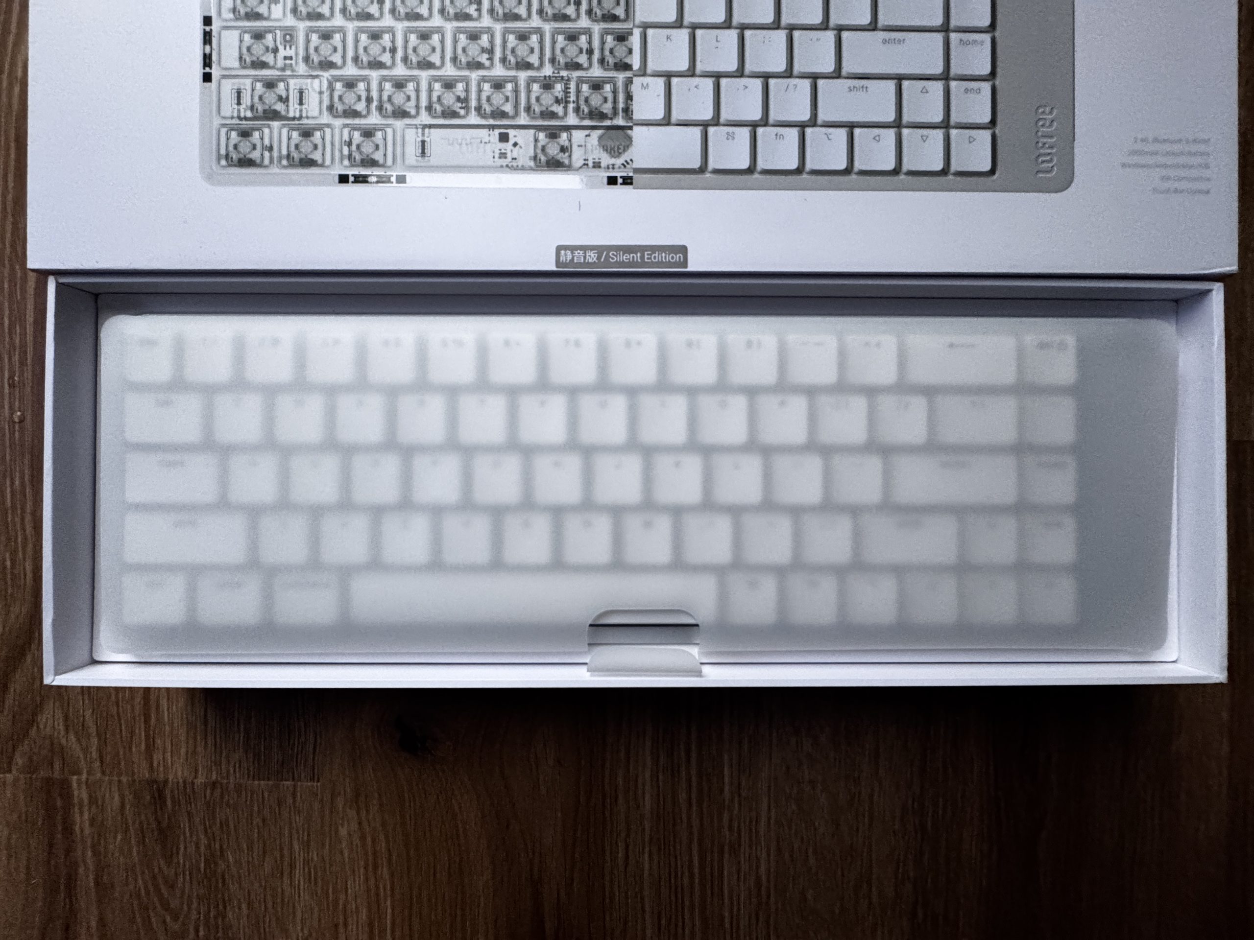
The keyboard is also packaged in a milky transparent protective cover, through which the white layout is only mutedly visible. The box itself is white and creates a bright, tidy overall impression. The interior of the packaging is clearly structured, the keyboard is in the middle and is held in place by precisely fitting edging. The look is modern and minimalist, matching the product design of the Flow 2.

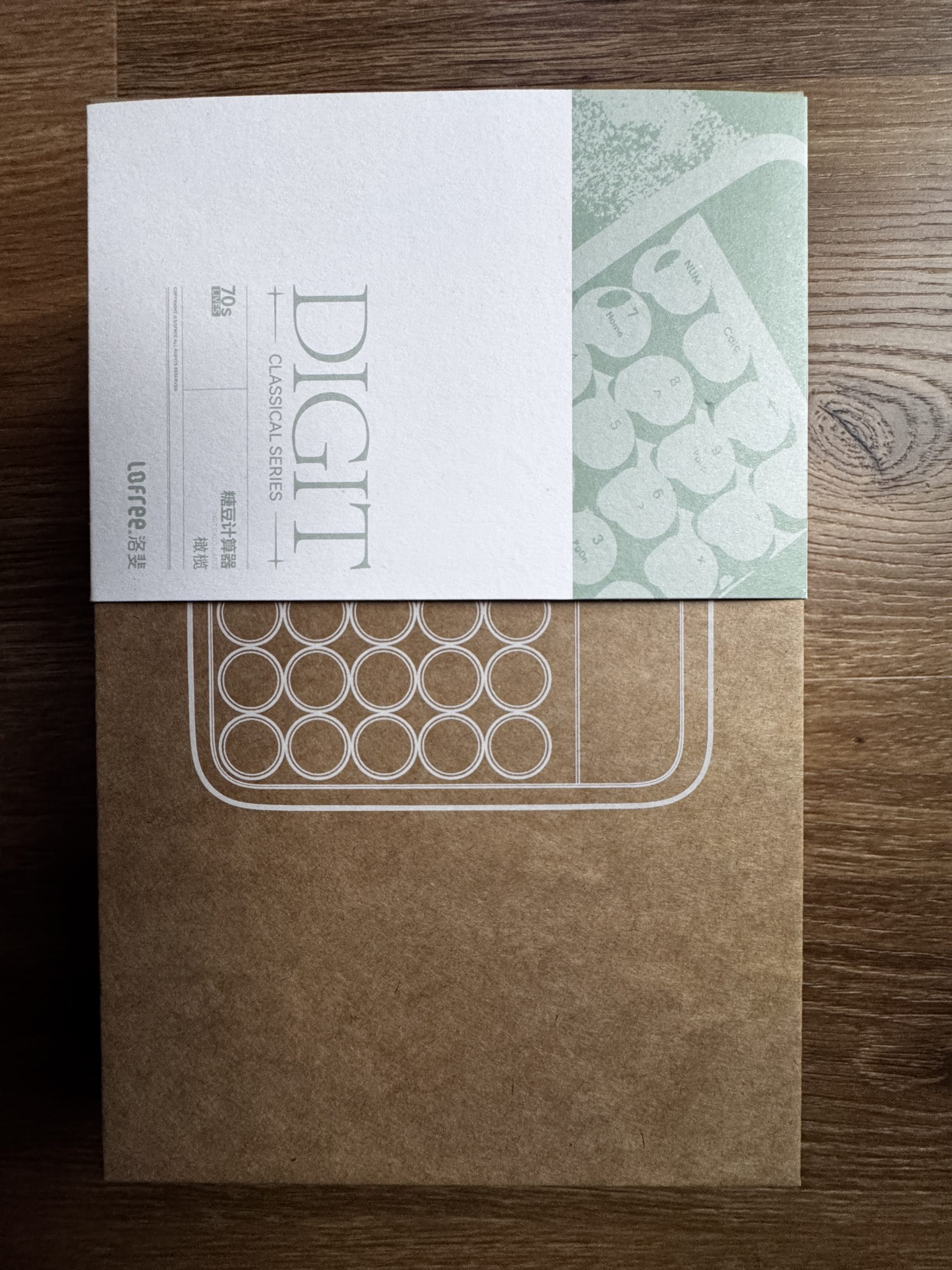
The packaging of the small Lofree calculator. The box combines a natural-colored cardboard with a white and greenish paper cover. The name Digit and the Classical Series can be seen on the top half. Underneath is a graphic line drawing of the calculator with its round keys. The design is deliberately simple and retro-inspired, in keeping with the vintage aesthetic of the device.

Since the calculator can be seen in the picture above, I’ll save myself the trouble of inserting a second picture at this point and go straight to the respective backs of the two boards.

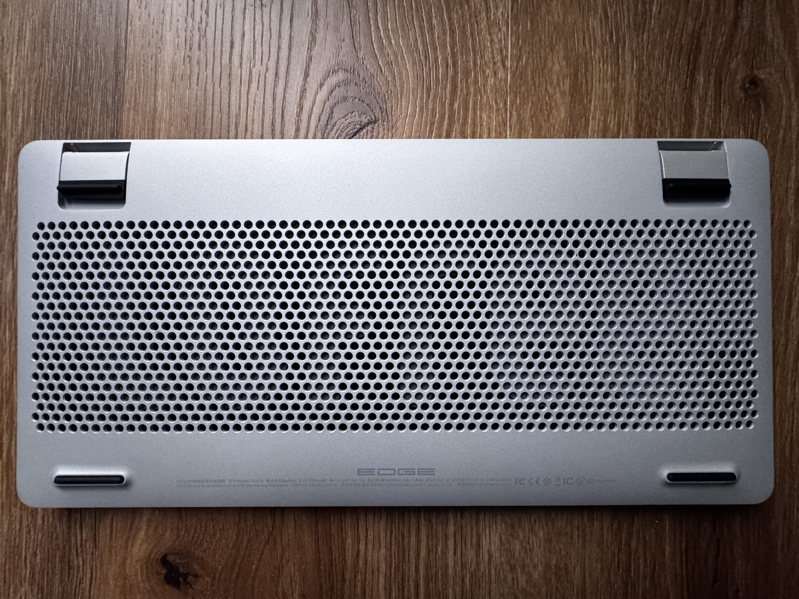
The underside consists of a silver metal housing with a large perforation in the middle, through which the inner workings are easily recognizable. At the top left and right are fold-out feet with black rubber elements that provide a stable support. There are also elongated rubber strips on the bottom edge that serve as non-slip supports. The overall design has a technical, well-ventilated and high-quality finish.

There’s something nice to go with it:

A carbon fiber display stand made from leftover material from Lofree Edge production. By recycling these leftover pieces, a lightweight yet sturdy holder is created that is suitable for various devices. The construction is designed to securely hold keyboards such as the Edge, but also other keyboards, tablets or laptops.

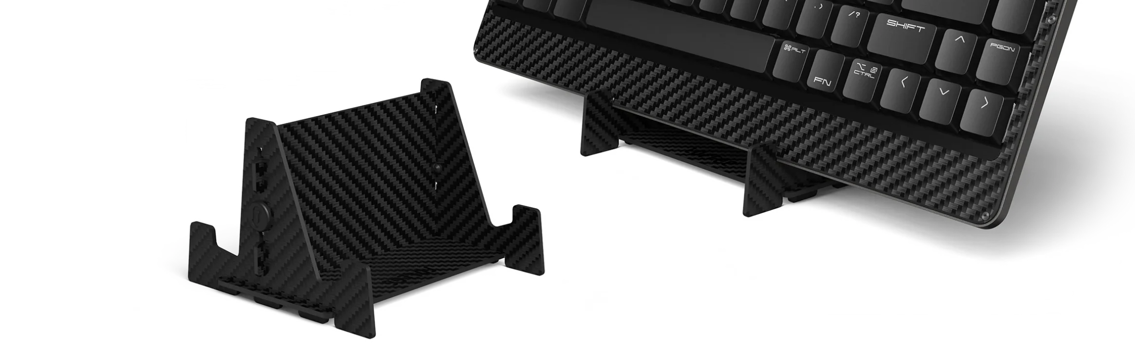
The stand follows a clear, minimalist design that leaves the structure of the carbon fiber visible and gives the accessory a modern technical character. The lightweight design facilitates transportation, while the robustness of the material ensures that devices are reliably supported. Zero has thus expanded the overall concept of the Lofree product family with a functional accessory that is both visually and practically well integrated.

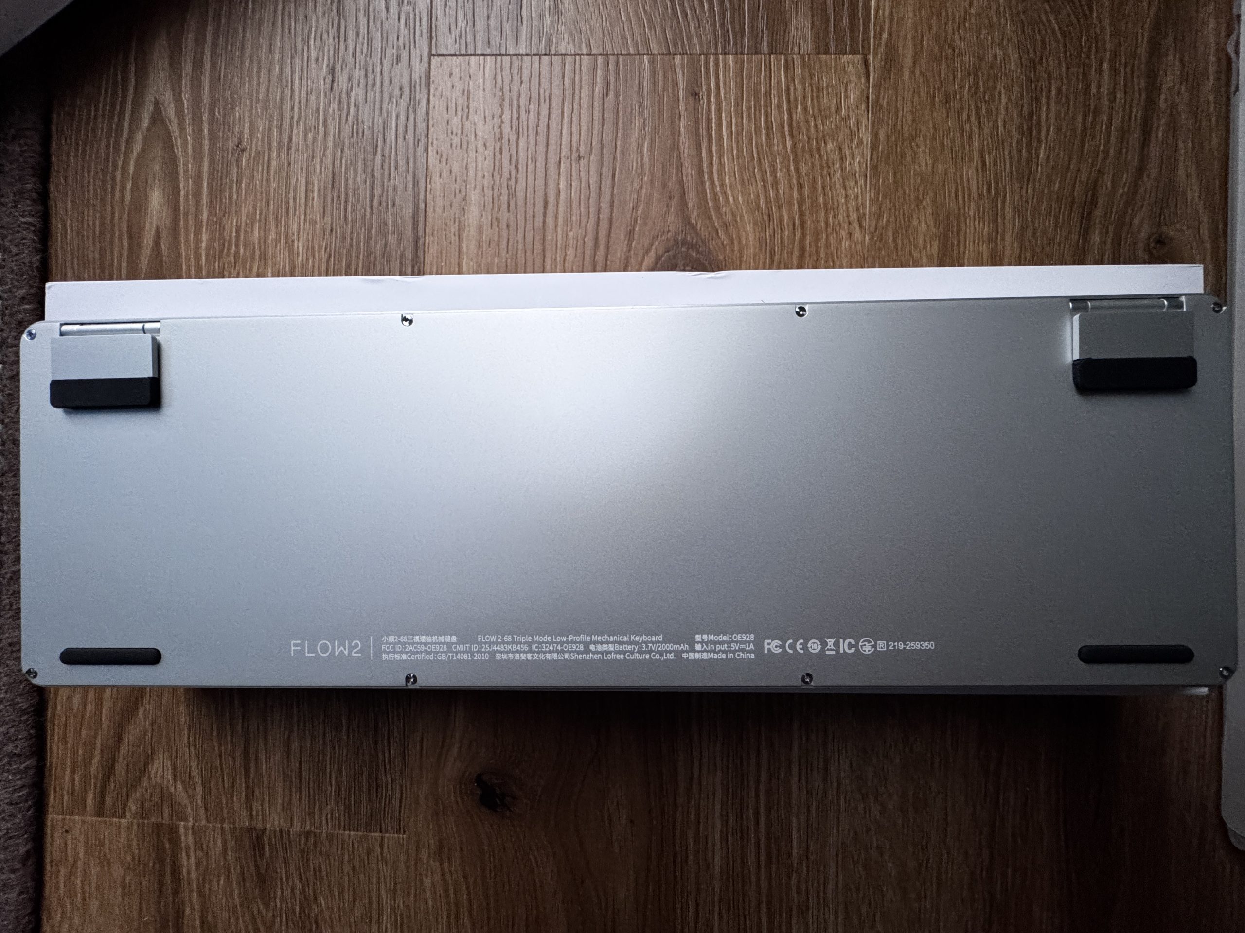
In contrast to the Edge, the Flow 2-68 does not have a perforated surface, but a continuous smooth metal plate. The two feet on the upper edge also have black rubber surfaces and appear stable. In addition, several screws can be seen along the edge of the housing, indicating a classic screw-fastened construction. The model designation Flow 2 is located on the bottom left-hand side together with technical information and certifications. The design appears reduced and functional, with a clear focus on a simple, closed housing.

The whole thing looks very good and I personally like it very much. Let’s take a look further.

Kommentar

Lade neue Kommentare

e
eastcoast_pete

Urgestein

3,083 Kommentare 2,042 Likes

Bei dem Taschenrechner hatte (hätte?) ich irgendwie erwartet, daß man ihn auch mit dem Rechner verbinden und als NumPad benutzen kann. Damit wäre er in der Tat nicht nur schön anzusehen und mechanisch interessant, sondern auch sehr praktisch gewesen. Denn selbst am bzw neben dem Rechner ist ein unabhängiger Taschenrechner, mit dem man schnell etwas berechnen kann ohne gleich Excel oder Calc starten zu müssen, oft praktisch. Gleichzeitig aber ist ein gutes NumPad wirklich essenziell, wenn man mal längere Tabellen füllen muss. Ein Gerät das umschaltbar beides kann wäre auch ohne das Keyboard ( @Karsten Rabeneck-Ketme : Sorry! ) dazu wirklich interessant.

Antwort 5 Likes

T
ThomasLeh

Veteran

225 Kommentare 186 Likes

Anscheinend hat Lofree auch einen Version von dem Taschenrechner welcher auch als NumPad funktioniert. Bzw. von der Bezeichnung ein NumPad, das als Taschenrechner funktioniert:
https://www.lofree.co/products/lipstick-tri-mode-wireless-numpad

Antwort 4 Likes

clrCMOS

Neuling

8 Kommentare 12 Likes

Erstmal danke für den Test, ich lese sowas immer sehr gern!
Als Numpad-/Taschenrechnerkombo Alternative käme auch das 8BitDo Retro 18 Mechanical in Frage. Kann BT5.0/2.4GHz/USB, hat einen Knopf um direkt den OS-Calculator zu starten und austauschbare Standard-Switches. Unendlich praktisch, gar nicht mal so hübsch, aber auch nicht so teuer.

View image at the forums

Antwort 4 Likes

Alter.Zocker

Urgestein

677 Kommentare 494 Likes

Stimme @eastcoast_pete zu insofern, falls der hier vorgestellte Taschenrechner vom selben Hersteller(!) KEINE Ziffernblock-Funktion für eine TKL-"Haupttastatur" zumindest aus dem "gleichen Hause" mitbringen sollte, das wäre ein Paradebespiel für "Chance vertan"...
Ich habe selber so einen separaten Taschenrechner/Ziffernblock (HErsteller weiß ich gerade nicht, farblich im original-"C64-Brotkastendesign") in Verbindung mit meiner Keychron 75 daheim in Einsatz, für den günstigen Preis hat das Ding ein ordentliches Tastengefühl, kommt zwar an die geschmeidigen HE-Switche der Keychron nicht ran, aber besser, als der ganze "Office-Standard-Müll" und ein Großteil des "Gamor-RGB-Krempels". Diese "Dual-Functionality" durch ein einfaches Zahlendisplay als Taschenrechner/Ziffernblock finde ich hier absolut überzeugend im Gegensatz zu all den winzigen "Show-Briefmarken-Displays" z.T. in "Tastengröße(!) auf all dem RGB-Bling-Gamer-Zeuch oder den überteuerten "Luxus-Bretteln"...

Btw. zu den von @ThomasLeh verlinkten "Lofree-Numpads" mit beworbener Rechnerfunktion: die Farbgebung und das Design sind indes v.a. für professionellen Einsatz schon reichlich "daneben", aber evtl. gibts das Ganze auch in weniger kitschiger Form und vielleicht ist ja auch das von Karsten hier vorgestellte Modell in deutlich angenehmerer Farbgebung genau so "Numpad"-fähig...?

Antwort 1 Like

Klicke zum Ausklappem
Alter.Zocker

Urgestein

677 Kommentare 494 Likes

Genau das habe ich , nur in "C64"-Farben und mit rotem Display (y)

Edit: Wenn man sich mal auf der Website von "Lofree" bissl umschaut zwischen all den PowerBanks in Lippenstift-Optik und "Mini-Piano" im Schreibmaschinendesign, dann hat man eher das Gefühl, das deren Zielkundschaft sonst hauptsächlich bei "Douglas" oder den "BEauty-Abteilungen" der Drogeriemärkte einkauft, da "passt" dann auch das lipstick-Produkt-Design wieder besser in den Kontext...

Antwort Gefällt mir

onyman

Veteran

271 Kommentare 146 Likes

Du sprichst mir aus der Seele.

Ich hatte mal zum Testen eine wunderschöne TKL-Tastatur und war überrascht wie oft mir das Nummernfeld gefehlt hat. Bei der Recherche nach separaten Num-Pads wird man zwar fündig, aber die passen nie zur Tastatur. Es ist mir ein Rätsel, warum die Keyboardhersteller zu Ihren Serien (mit zig Tastern, Farben, TKL oder mit, mit oder ohne Maus, etc.pp) nicht passende Nummernpads anbieten.

Antwort 2 Likes

D
Dodga

Mitglied

10 Kommentare 4 Likes

Vor einer Woche ist bei mir die Lofree Flow 2 angekommen – zwar offiziell nur eine 96%-Variante, aber ich wollte eine wirklich leise Tastatur. Ich bin noch in der Eingewöhnungsphase, aber sehr zufrieden damit. Da es diese Tastatur allerdings nur im ANSI-US-Layout gibt, dauert die Umstellung etwas länger. Bislang überwiegen aber eindeutig die Vorteile.

Frage an die Community:
Arbeitet hier jemand mit US-ANSI-Layout? Wie handhabt ihr Umlaute? Ich nutze derzeit EurKey als Tastaturlayout. Gibt es noch andere – vielleicht bessere – Möglichkeiten?

Antwort Gefällt mir

Alter.Zocker

Urgestein

677 Kommentare 494 Likes

Wenn ich auf US-Ansi. schreiben muss (kommt bei einigen Industry-KEyboards vor), nutze ich keine Umlaute sondern schreibe sie aus, also z.B. "ue" für "ü" usw.

Antwort 1 Like

Grainger

Mitglied

21 Kommentare 22 Likes

Ich habe hier noch ein altes HP Calcpad 200, dass ebenso als mobiler Taschenrechner wie auch als Numpad verwendet werden konnte.
Wird über USB an den Rechner angeschlossen (das Calcpad hat allerdings noch einen USB Mini-Anschluss) und funktioniert immer noch einwandfrei.

Gab es also schon 2009.

Die erweiterten Funktionen (Excel und Word über Taste zu starten bzw. Ergebnisse des Taschenrechners direkt dorthin zu übertragen) habe ich seit vielen Jahren nicht mehr genutzt.

Zum einen weil die dafür notwendige HP-Software vollkommen veraltet ist (auf dem Stand von Windows 98) und zum anderen weil ich kein MS Office mehr verwende (bin zu Softmaker Office gewechselt).

Antwort 1 Like

Karsten Rabeneck-Ketme

Moderator

317 Kommentare 135 Likes

Immer ANSI!! Nie was anderes. Wie man damit umgeht ? Entweder Tasten merken oder ein German Keycap Set verbauen. Dann passt es auch. Oder wenn man schon ein gutes Set hat, das International Kit besorgen.

Antwort 1 Like

e
eastcoast_pete

Urgestein

3,083 Kommentare 2,042 Likes

Kann gut sein, daß sowas schon länger geht bzw gibt, aber wenn nicht, gibt's denn eine Browser Erweiterung (die nicht gleich "nach Hause" funken will) , die ae, ue, oe automatisch in die entsprechenden Umlaute umschreibt? Und wenn es so eine Erweiterung bereits gibt, wär ich für den Namen dankbar, damit ich sie dann finden kann.

Antwort Gefällt mir

Karsten Rabeneck-Ketme

Moderator

317 Kommentare 135 Likes

Wenn du eine ANSI-Tastatur hier am PC anschließt, wird sie auch Deutsch schreiben. Installierst du US-Layout, wird sie das schreiben, was auf den ANSI-Keycaps steht. Also meine schreibt auch normal Deutsch. Und selbst wenn sie es nicht tun würde, könntest du sie in VIA dementsprechend auf die Layer konfigurieren. Das ist ANSI mit den passenden Caps. Das andere ist ANSI mit ISO-DE-Caps. Und bei Keycap Sets wie z. B. dem PBTfans Resonance Kit, kannst du ein International Kit kaufen. Da sind dann die umlaute drin und die korrekten Symbole der Number Row, die korrekten Z und Y Caps etc. etc.

Antwort 1 Like

j
juppeck

Mitglied

24 Kommentare 8 Likes

Warum sich die Hersteller nicht daran gewöhnen können, dass es mehr als nur eine Nationalität, als die der Amerikanischen gibt, will sich mir nicht öffnen.

Antwort Gefällt mir

Karsten Rabeneck-Ketme

Moderator

317 Kommentare 135 Likes

Naja, das kann ich nicht sagen. MonacoKeys ist z. B. jemand, der sich sehr dafür einsetzt. Wenn ich aber ein Format aussuchen müsste, was die meisten abdeckt, würde ich auch das ANSI wählen. Alleine schon deswegen, weil das auch einfach besser aussieht als diese klobige, dicke Enter-Taste. Aber das ist natürlich Geschmacksache.

Antwort Gefällt mir

Igor Wallossek

1

13,159 Kommentare 26,153 Likes

Die Enter-Taste hat ergonomische Gründe. Ich sags mal so, die beiden teuren Tastaturen, die ich hier habe, treiben mich als 10-Finger-Schreiber permanent in den Wahnsinn, weil der Block mit Ins und Del genau eine Zeile zu hoch sitzt. Dann drückt man Del, obwohl man es gar nicht wollte... Form follows function, aber das kapiert einfach keiner. :D

Antwort Gefällt mir

T
ThomasLeh

Veteran

225 Kommentare 186 Likes

Ich habe einmal eine Ansi gehabt, ich habe trotz nicht 10 Finger Blind ständig bei der Enter-Taste daneben gehauen.
Bei der Quertykeys QK101 verschreiben ich mich gerade immer Mal um einen Buchstaben nach rechts. Ich habe noch nicht raus woran es liegt.
Entweder wegen den Black on Black PBS Keycaps oder ich habe auch die 7U Leertaste im Verdacht.
Mit dem DEL/INS habe ich nicht so die Probleme wie Igor, aber die Tasten nutze ich auch weniger

Man merkt irgendwie erst wenn man bei Tastaturen etwas rumexperimentiert hat, was man weglassen/ändern kann und was nicht. Das macht es zusätzlich zu einem teuren Hobby. Wenn ich mit der Erfahrung die ich jetzt mit den wenigen Builds gesammelt habe eine Tastatur entwerfen würde, wäre es ein Iso-Full-Layout abzüglich der F-Reihe. Und über den Pfeil-Tasten 5 Tasten + Lautstärke Drehknopf. Das Layout gibt es leider nicht 🤣

Antwort Gefällt mir

j
juppeck

Mitglied

24 Kommentare 8 Likes

Ich benutze seit einigen Jahren eine Logitech-Craft und im Büro eine MX. Es sind bisher mit Abstand die besten Keyboards, die ich je verwendet habe. Ich komme aus einer Zeit, da war die IBM PS/2 Klacker-Tastatur, mit wechselbaren Tastenkappen und Spiralkabel, das Maß der Dinge.

Mit so einem Teil könnte ich heute gar nicht mehr schreiben. Mich erinnern die Gamer-Keyboards ein wenig an diese Zeit.
Viel Design und sehr funktional aus Gaming ausgerichtet. Ich finde die Dinger grausam, aber ich spiele auch nicht.

Antwort Gefällt mir

Victorbush

Urgestein

1,009 Kommentare 242 Likes

Ich dachte Carbon…cool…

Dann las ich ANSI ….. ich weiß ja nicht wie viele hier im Forum ANSI Tastaturen nutzen, ….
Ich nicht, will ich auch nicht ….auf Arbeit gibt es Qwertz 100%, im Luxus Fall von Cherry, dann tue ich mir das Ostereiersuchen auf ner ANSI nicht freiwillig an. Ich freue mich aber schon auf einen zukünftigen Tastaturtest mit Teutonentasten.

Ich wünsche einen schönen 2ten Advent! 🎄

Antwort Gefällt mir

Danke für die Spende


Du fandest, der Beitrag war interessant und möchtest uns unterstützen? Klasse!

Hier erfährst Du, wie: Hier spenden.

Hier kannst Du per PayPal spenden.

About the author

Karsten Rabeneck-Ketme

Werbung

Werbung